ROSEMONT, IL (April 2, 2020) – The key to attracting consumers’ eyes in the coming years is through combining colors in new and unexpected ways, says Leatrice Eiseman, executive director of the Pantone Color Institute and color expert for the International Housewares Association (IHA). Eiseman was scheduled to give a keynote presentation on “Innovation: The Key to Success Through Color + Trends” at The Inspired Home Show 2020.
After the Show was canceled amid concerns over COVID-19, Eiseman shared with IHA information she would have presented.
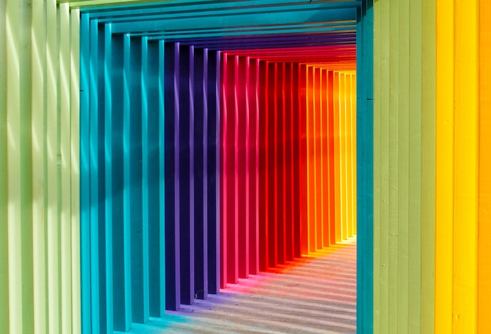
“Innovation is a big buzzword right now, not just in housewares but in many different industries,” said Eiseman. “It’s about answering a need for something edgier and, in some cases, irreverent. That’s not to discard the fact that some consumers have a certain comfort level with some colors. You have to honor that by combining those traditional color favorites with other unexpected colors or in unexpected ways.”
Eiseman looks to several different industries for color trends and inspiration, including fashion, art, cosmetics, electronics, automobiles, movies and television.
She predicts the film industry will become even more significant in the short-term as more people turn to movies as a form of entertainment. ‘Avatar 2’ – due out next year – takes place underwater and features sleek stylings and vivid blues.
“Some people may ask: ‘What does the movie Avatar have to do with the pillows I’m choosing for my living room?’” says Eiseman. It’s all about what she calls the trickle-down effect: what we see in movies, fashion, art and more causes people to be more open to a color, or even to look for it in the marketplace.
Just a few current significant themes or design influences she cites are:
- Food & beverage – “Food is a natural tie-in for housewares and interiors because it’s so integral to our sense of well-being and to our very existence,” says Eiseman. An interesting color note: Anything with yellow-based color releases the “feel-good” chemical serotonin in our bodies; think comfort foods from around the world such as macaroni & cheese in the U.S., dim sum in China and purees in Africa.
- Wellness – This trend keeps getting bigger each year and will certainly flourish in the wake of the COVID-19 pandemic. Soft, familiar hues can convey a sense of calm and comfort, as can Pantone’s 2020 Color of the Year – Classic Blue, which instills “calm, confidence and connection.”
- Sustainability – It’s not a new trend, but one that has reached the mainstream. Many consumers around the world are now demanding products and practices that are environmentally friendly and are choosing home environments and color schemes that reflect this.
Eiseman also revealed the nine 2021 Pantone View Home + Interiors palettes. These color combinations, which reflect the many color trends and influences in the marketplace, are:
- Folkloric – This palette is Nordic in feel, but “it’s really about a new and energized form of folk art,” she says. It features deeply saturated authentic colors that look handmade (not like they were made by chemicals) including indigos and fern greens.
- Terracotta – The first palette that’s named after one color, it features a warm, earthy color that appeals to people in just about any culture. Though Terracotta is the star, it appears alongside a sliding scale of warm earthy tones but with a few very unexpected colors, like Lilac Sachet, as well.
- Composed – “This is the palette that is always necessary for those consumers who are comfortable with neutrals,” says Eiseman. Here, soft pinks and blues “lighten the load of gray” to combine with hues like Glacier Gray and Granite Gray.
- Vivify – The yang to the yin of Composed, Vivify is “an eclectic grouping” of playful and cheerful colors such as Easter Egg blue and Meadowlark. Black and white are included as well to create a dichotomy of sorts.
- Fleur – Flowers are always an influence on color, but this palette is “not just about a sweet bouquet,” says Eiseman. It’s “a bit sexier” with its inclusion of some deeper wine or merlot hues, and includes some green for balance.
- Quixotic – This vibrant palette features some closely matched colors but it also reaches across the color wheel for unique contrasts. Just a few examples: Jade Lime vs Peppery Cayenne and Papaya Punch vs Tranquil Blue Sky.
- Polychrome – This palette is “very much about patterning,” says Eiseman. Architectural details from many countries were an inspiration for using sophisticated colors like a Dijon-enriched spicy mustard and Mocha Mousse in patterns.
- Synergy – Blues and blue-greens may always be favored by some, so this palette uses them to create “peaceful, pleasing connections of color.” Grayed-down versions of blue and blue-green contrast seamlessly with other colors such as grayed-down lilac or mauve.
- Galaxies – Metallics get their day in this palette, which is inspired by “the ongoing fascination humans have with the galaxies that lie beyond,” says Eiseman. What is unique here is that metallics are combined with earthier tones that help ground them.
Additional educational sessions from the Show will be posted on the Show’s website, including presentations from the Innovation Theater and Smart Talks stage.
For more information about the Show’s displays, including The New Product Showcase, visit TheInspiredHomeShow.com. To learn about new products that were to be at the Show, visit the Show’s online directory, Housewares Connect 365 at Housewares.org/housewaresconnect365, and select “Featured New Products for Media & Buyers.”