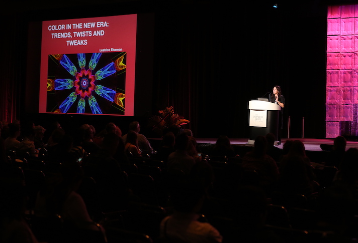
ROSEMONT, IL (March 12, 2019)—We must be especially clever when trying to attract consumers’ eyes with color, Leatrice Eiseman – executive director of the Pantone Color Institute and color expert for the International Housewares Association (IHA) – told the audience last week during her second keynote session, “Color/Texture/Finish: Back to the Future,” at the 2019 International Home + Housewares Show.
“The bar has been raised across many industries to really create some fabulous color combinations and patterns,” said Eiseman, explaining how the proliferation of digital media has exposed consumers to more color than ever before.
Owned and operated by the IHA, the Show was held March 2-5 at McCormick Place and featured more than 2,200 exhibitors and 60,000 total attendees from 130 countries. In 2020, the Show will be renamed The Inspired Home Show®, IHA’s Global Home + Housewares Market.
“Trends don’t go away in one year,” Eiseman said. So, while one color might remain popular for a few years, it’s more about constantly reinventing color combinations in order to attract attention. With that said, she launched into the latest updates and directions in each of the color families:
- Reds: Red has always been a perennial favorite in the housewares industry, but “the cleverness of the red today and the tone and the psychology of it is important to consider,” Eiseman said. Red implies physical action and energy, as well as style and glamour. If you want to convey heat, you should use a warmer tone or a “truer” red (with both warm and cool tones). Bluer reds imply a certain amount of sophistication.
- Pinks: Don’t forget pinks are actually part of the red family, Eiseman reminded the crowd, though “there are many layers and many levels of pink.” Today, pinks are being used much more in all rooms of the home, not just bedrooms or bathrooms. They’re also being used in unexpected products such as audio speakers. According to Eiseman, one of the most interesting trends in display and online is using the combination of earth tones and hot pink.
- Oranges: “Terracotta tones, when used in either the background or the foreground, really have become classics,” said Eiseman. When it comes to peach, using “just a tinge of peach” is hot in the fashion world. Coral can be seen in everything from ear buds to mopeds.
- Yellows: “Yellow has become so strong in fashion that it’s seeping into other color families,” she explained. Because of its association with sunshine, “Anything that has a yellow base to it certainly can help to enhance the mood.” Yellows that are “honeyed” down are generally the most preferred in the U.S., and mustard tones have been trending in the last few years.
- Greens: According to Eiseman, one of the most interesting developments in this family is the popularity of avocado. Wildly popular in the 1970s (and largely on the outs since then because of that connotation), the avocado – avocado toast in particular – is “currently is one of the darlings of the food industry,” she said. “New” and “fresh” are the most common responses to the color in word association studies today.
- Blues: One of the more unusual but eye-catching combinations in the blue family is turquoise and avocado, said Eiseman. A hue coming back very strong on fashion runways is a deep indigo blue. And, something new to consider: “You don’t see blue-purples as much in the housewares marketplace, but it always comes up very strong in surveys,” Eiseman said.
- Purples: Redder purples add energy, and deepening a purple adds a restful connotation, she said. Lavenders and violets today are almost always linked to relaxation, while mauves with grayed undertones can become a beautiful neutral.
- Browns: Brown today conveys a sense of richness or a natural vibe, said Eiseman. Browns with grays can be “an absolutely stunning combination” in homes and in fashion.
- Grays: Grays are a “dependable classic,” but the newest trend in the gray family is charcoals, which are “very deep and very sophisticated” in feel, she said.
- Black and White: Eiseman said she loves the combination of black and white. “There can be a bit of tension created when you combine black and white, but that’s not necessarily a bad thing. Creating tension actually can attract attention.”
- Metallics: There’s so much being done with metallics, especially silver, chrome, nickel, brass and very shiny gold. (Copper is one metallic not as on-trend for the coming years.) Foil treatments are popular, as are metallics with green undertone and striated presentations.
For more information about The Inspired Home Show®, IHA’s Global Home + Housewares Market, visit TheInspiredHomeShow.com or Housewares.org.

